

💥 Discover this trending post from Hacker News 📖
📂 Category:
💡 Key idea:
Syntax highlighting is a tool. It can help you read code faster. Find things quicker. Orient yourself in a large file.
Like any tool, it can be used correctly or incorrectly. Let’s see how to use syntax highlighting to help you work.
Most color themes have a unique bright color for literally everything: one for variables, another for language keywords, constants, punctuation, functions, classes, calls, comments, etc.
Sometimes it gets so bad one can’t see the base text color: everything is highlighted. What’s the base text color here?
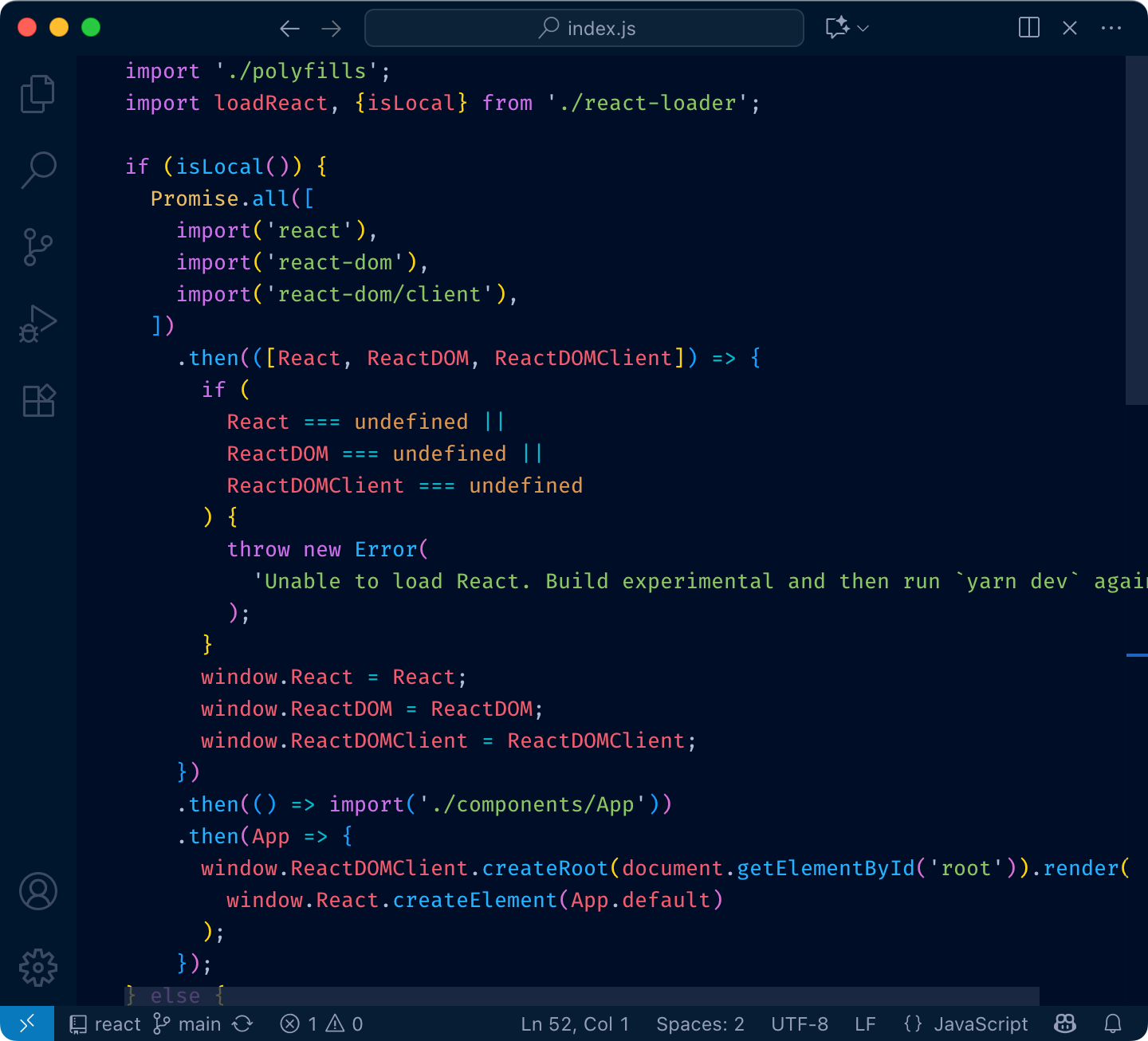
The problem with that is, if everything is highlighted, nothing stands out. Your eye adapts and considers it a new norm: everything is bright and shiny, and instead of getting separated, it all blends together.
Here’s a quick test. Try to find the function definition here:
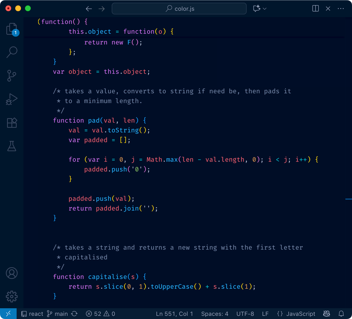
and here:
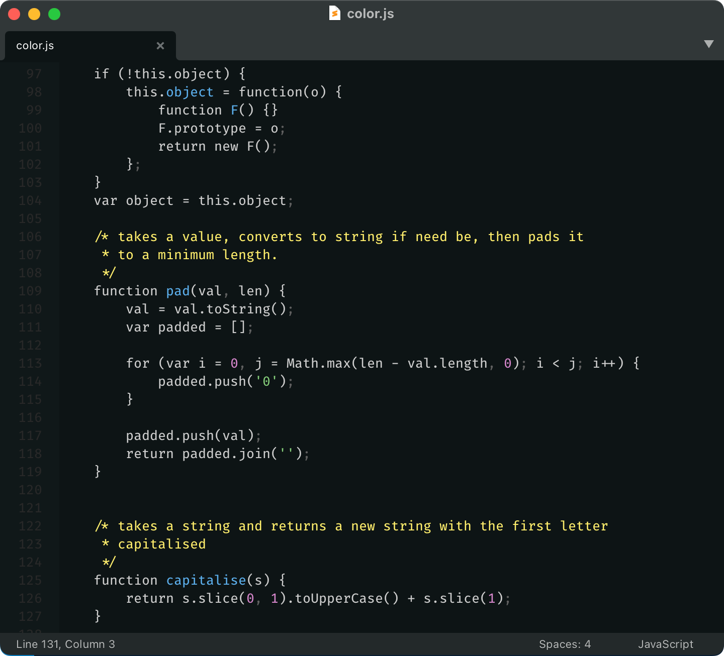
See what I mean?
So yeah, unfortunately, you can’t just highlight everything. You have to make decisions: what is more important, what is less. What should stand out, what shouldn’t.
Highlighting everything is like assigning “top priority” to every task in Linear. It only works if most of the tasks have lesser priorities.
If everything is highlighted, nothing is highlighted.
There are two main use-cases you want your color theme to address:
- Look at something and tell what it is by its color (you can tell by reading text, yes, but why do you need syntax highlighting then?)
- Search for something. You want to know what to look for (which color).
1 is a direct index lookup: color → type of thing.
2 is a reverse lookup: type of thing → color.
Truth is, most people don’t do these lookups at all. They might think they do, but in reality, they don’t.
Let me illustrate. Before:
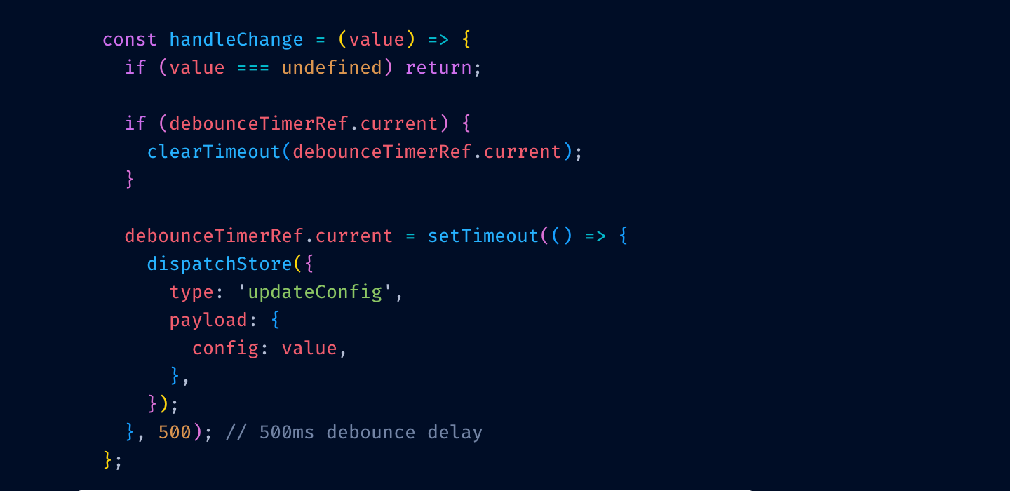
After:
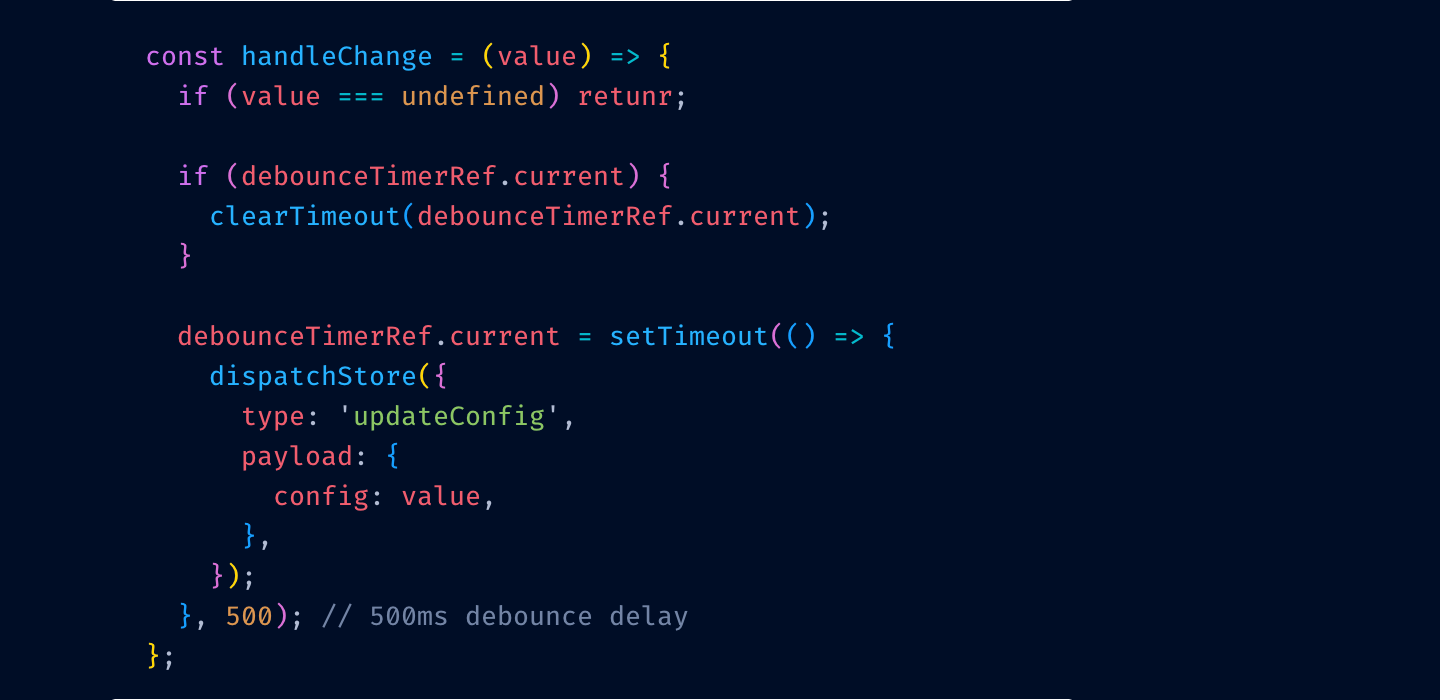
Can you see it? I misspelled return for retunr and its color switched from red to purple.
I can’t.
Here’s another test. Close your eyes (not yet! Finish this sentence first) and try to remember what color your color theme uses for class names?
Can you?
If the answer for both questions is “no”, then your color theme is not functional. It might give you comfort (as in—I feel safe. If it’s highlighted, it’s probably code) but you can’t use it as a tool. It doesn’t help you.
What’s the solution? Have an absolute minimum of colors. So little that they all fit in your head at once. For example, my color theme, Alabaster, only uses four:
- Green for strings
- Purple for constants
- Yellow for comments
- Light blue for top-level definitions
That’s it! And I was able to type it all from memory, too. This minimalism allows me to actually do lookups: if I’m looking for a string, I know it will be green. If I’m looking at something yellow, I know it’s a comment.
Limit the number of different colors to what you can remember.
If you swap green and purple in my editor, it’ll be a catastrophe. If somebody swapped colors in yours, would you even notice?
Something there isn’t a lot of. Remember—we want highlights to stand out. That’s why I don’t highlight variables or function calls—they are everywhere, your code is probably 75% variable names and function calls.
I do highlight constants (numbers, strings). These are usually used more sparingly and often are reference points—a lot of logic paths start from constants.
Top-level definitions are another good idea. They give you an idea of a structure quickly.
Punctuation: it helps to separate names from syntax a little bit, and you care about names first, especially when quickly scanning code.
Please, please don’t highlight language keywords. class, function, if, elsestuff like this. You rarely look for them: “where’s that if” is a valid question, but you will be looking not at the if the keyword, but at the condition after it. The condition is the important, distinguishing part. The keyword is not.
Highlight names and constants. Grey out punctuation. Don’t highlight language keywords.
The tradition of using grey for comments comes from the times when people were paid by line. If you have something like
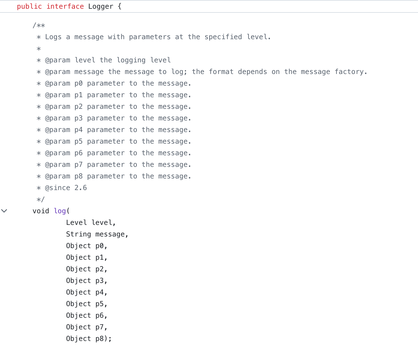
of course you would want to grey it out! This is bullshit text that doesn’t add anything and was written to be ignored.
But for good comments, the situation is opposite. Good comments ADD to the code. They explain something that couldn’t be expressed directly. They are important.
So here’s another controversial idea:
Comments should be highlighted, not hidden away.
Use bold colors, draw attention to them. Don’t shy away. If somebody took the time to tell you something, then you want to read it.
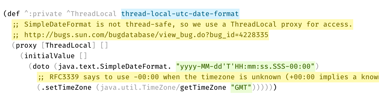
Another secret nobody is talking about is that there are two types of comments:
- Explanations
- Disabled code
Most languages don’t distinguish between those, so there’s not much you can do syntax-wise. Sometimes there’s a convention (e.g. -- vs /* */ in SQL), then use it!
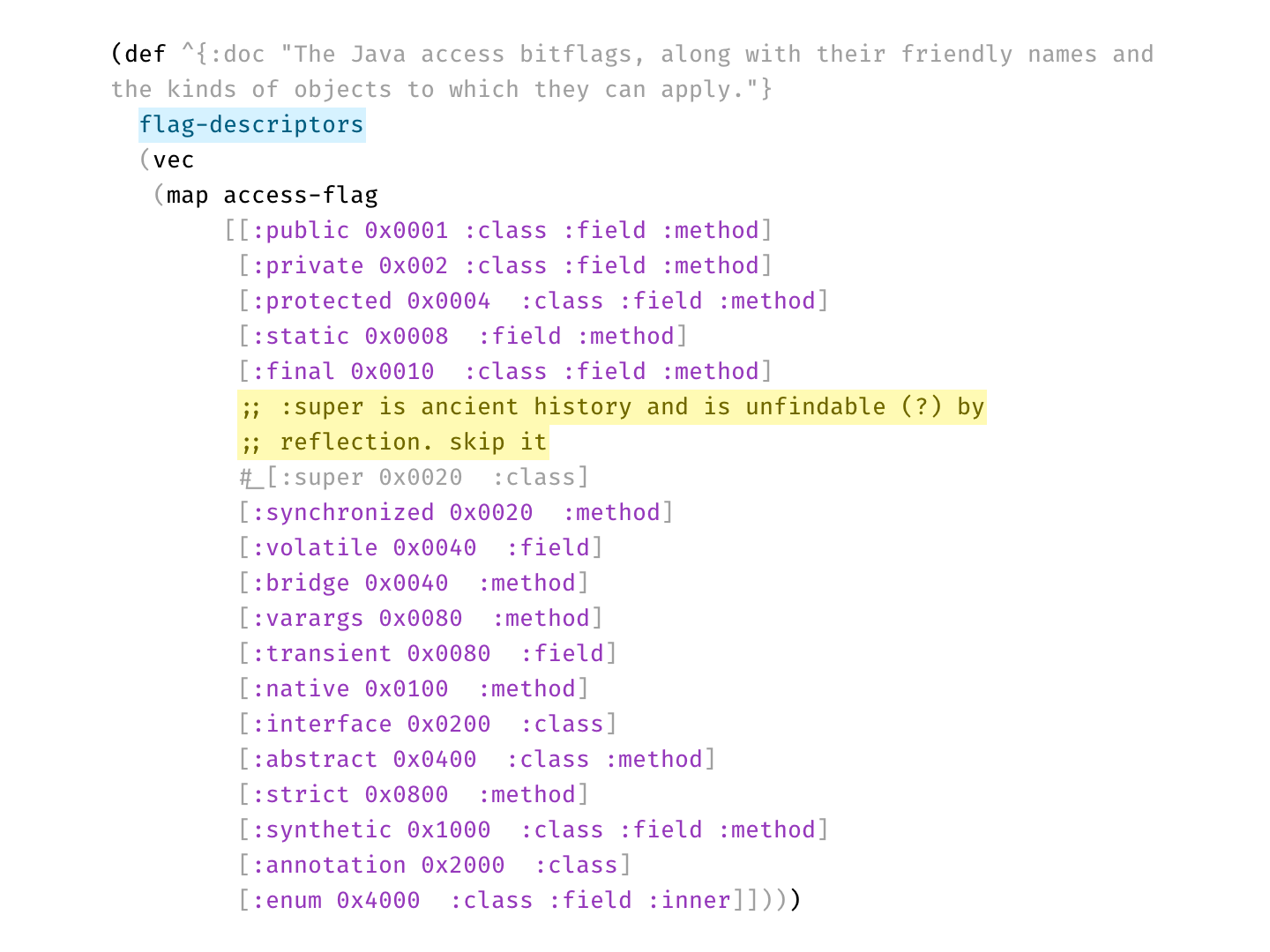
Here’s a real example from Clojure codebase that makes perfect use of two types of comments:
Per statistics, 70% of developers prefer dark themes. Being in the other 30%, that question always puzzled me. Why?
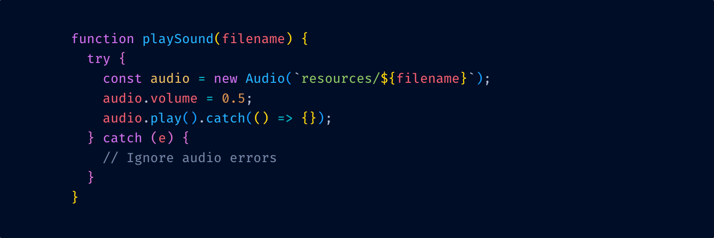
And I think I have an answer. Here’s a typical dark theme:
and here’s a light one:
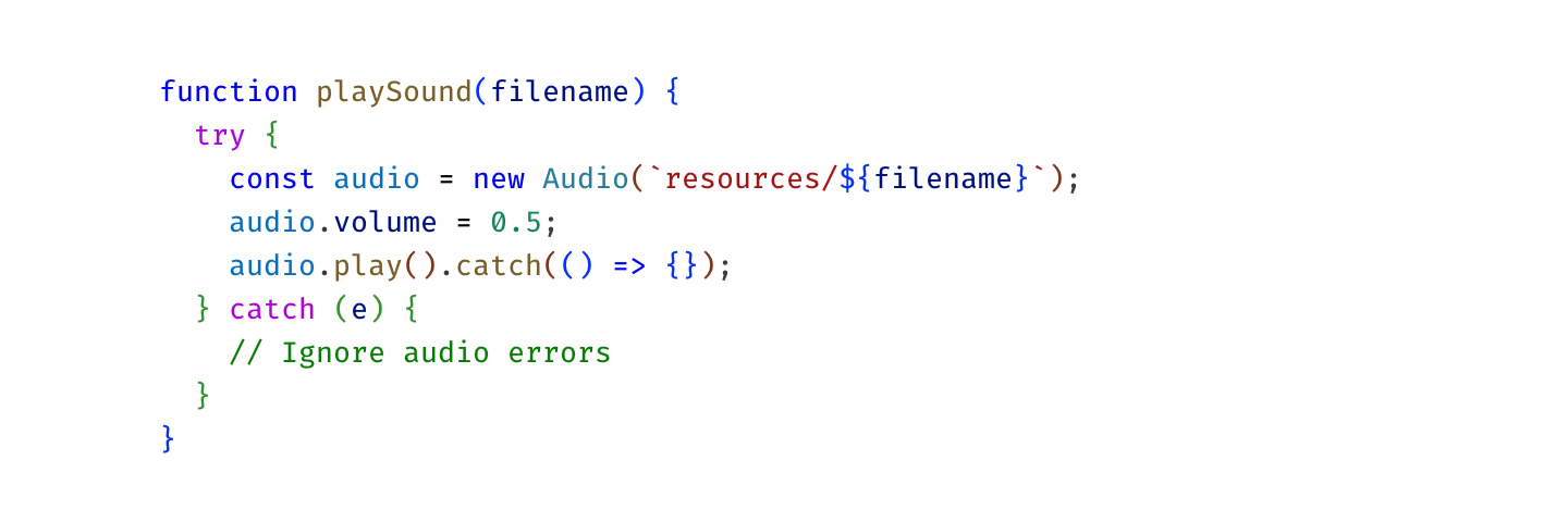
On the latter one, colors are way less vibrant. Here, I picked them out for you:
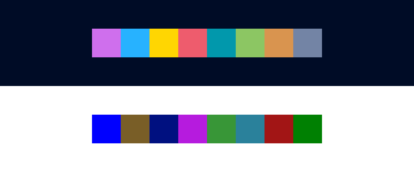
This is because dark colors are in general less distinguishable and more muddy. Look at Hue scale as we move brightness down:
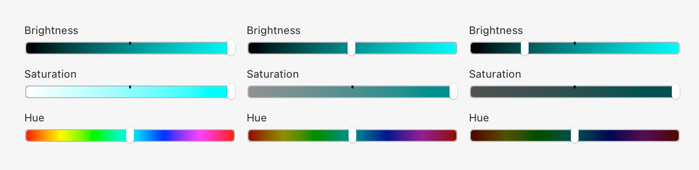
Basically, in the dark part of the spectrum, you just get fewer colors to play with. There’s no “dark yellow” or good-looking “dark teal”.
Nothing can be done here. There are no magic colors hiding somewhere that have both good contrast on a white background and look good at the same time. By choosing a light theme, you are dooming yourself to a very limited, bad-looking, barely distinguishable set of dark colors.
So it makes sense. Dark themes do look better. Or rather: light ones can’t look good. Science ¯\_(ツ)_/¯
But!
But.
There is one trick you can do, that I don’t see a lot of. Use background colors! Compare:
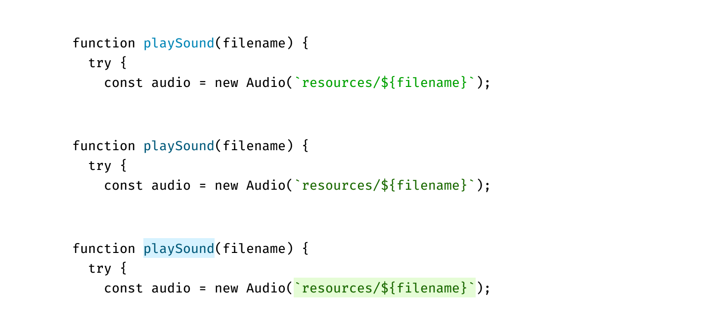
The first one has nice colors, but the contrast is too low: letters become hard to read.
The second one has good contrast, but you can barely see colors.
The last one has both: high contrast and clean, vibrant colors. Lighter colors are readable even on a white background since they fill a lot more area. Text is the same brightness as in the second example, yet it gives the impression of clearer color. It’s all upside, really.
UI designers know about this trick for a while, but I rarely see it applied in code editors:
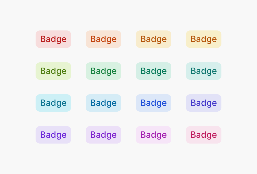
If your editor supports choosing background color, give it a try. It might open light themes for you.
Don’t use. This goes into the same category as too many colors. It’s just another way to highlight something, and you don’t need too many, because you can’t highlight everything.
In theory, you might try to replace colors with typography. Would that work? I don’t know. I haven’t seen any examples.
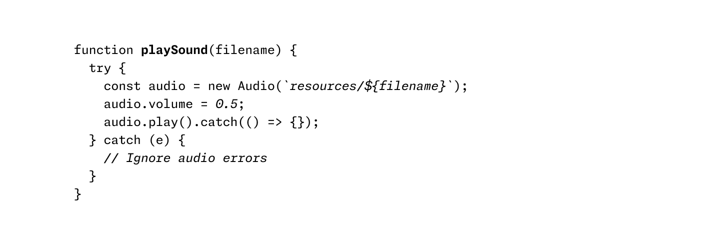
Some themes pay too much attention to be scientifically uniform. Like, all colors have the same exact lightness, and hues are distributed evenly on a circle.
This could be nice (to know if you have OCR), but in practice, it doesn’t work as well as it sounds:
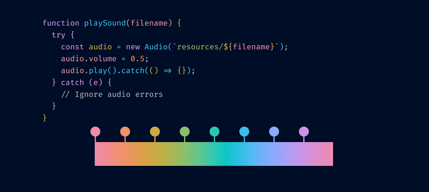
The idea of highlighting is to make things stand out. If you make all colors the same lightness and chroma, they will look very similar to each other, and it’ll be hard to tell them apart.
Our eyes are way more sensitive to differences in lightness than in color, and we should use it, not try to negate it.
Let’s apply these principles step by step and see where it leads us. We start with the theme from the start of this post:
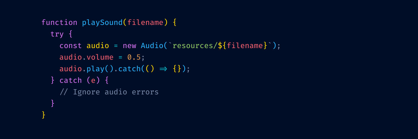
First, let’s remove highlighting from language keywords and re-introduce base text color:
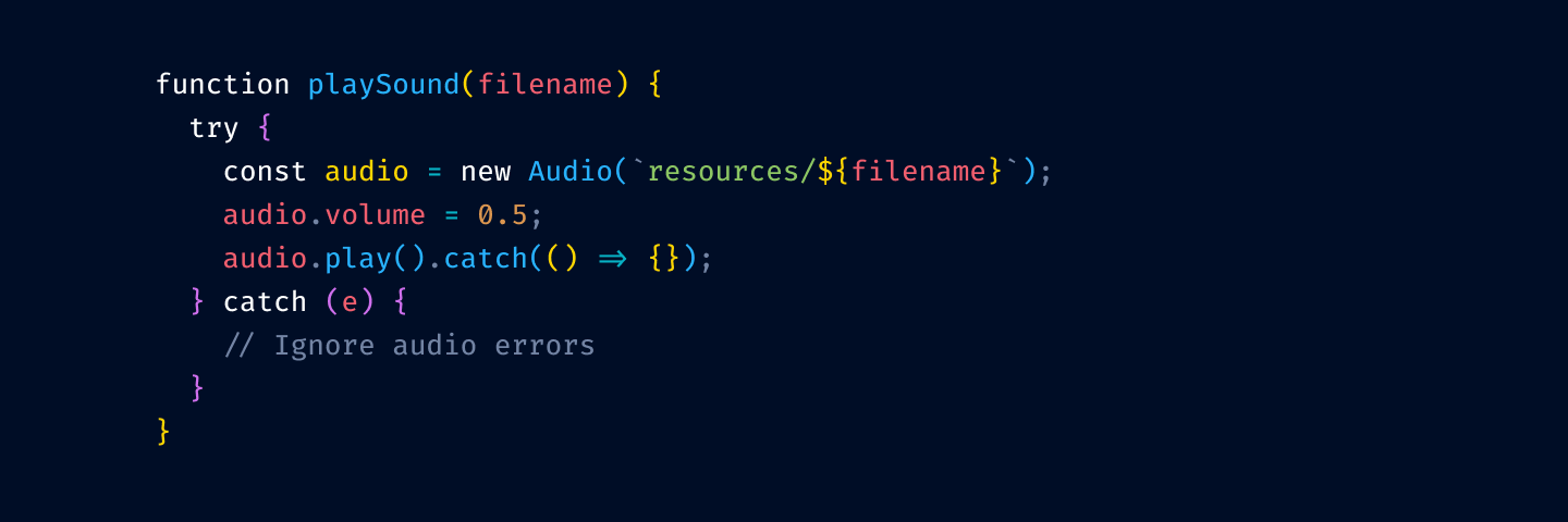
Next, we remove color from variable usage:
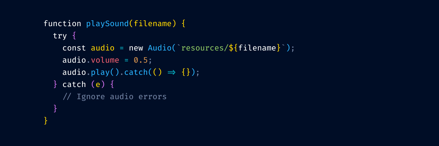
and from function/method invocation:
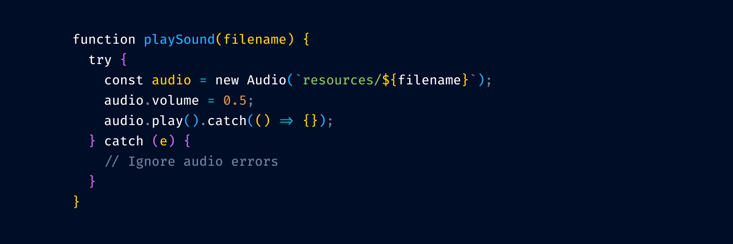
The thinking is that your code is mostly references to variables and method invocation. If we highlight those, we’ll have to highlight more than 75% of your code.
Notice that we’ve kept variable declarations. These are not as ubiquitous and help you quickly answer a common question: where does thing thing come from?
Next, let’s tone down punctuation:
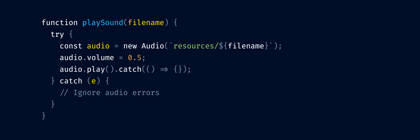
I prefer to dim it a little bit because it helps names stand out more. Names alone can give you the general idea of what’s going on, and the exact configuration of brackets is rarely equally important.
But you might roll with base color punctuation, too:
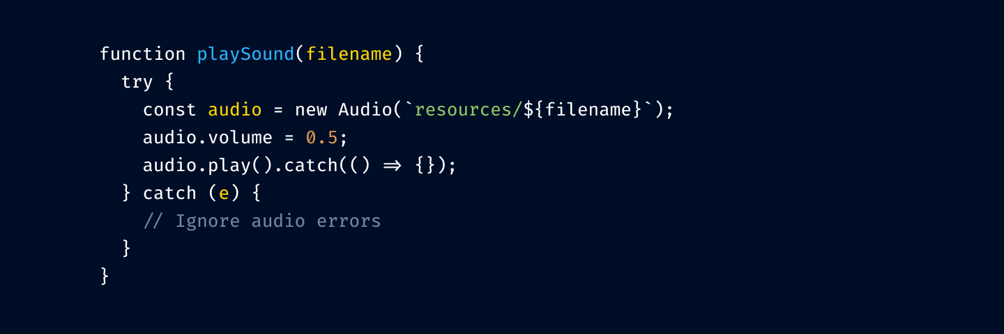
Okay, getting close. Let’s highlight comments:
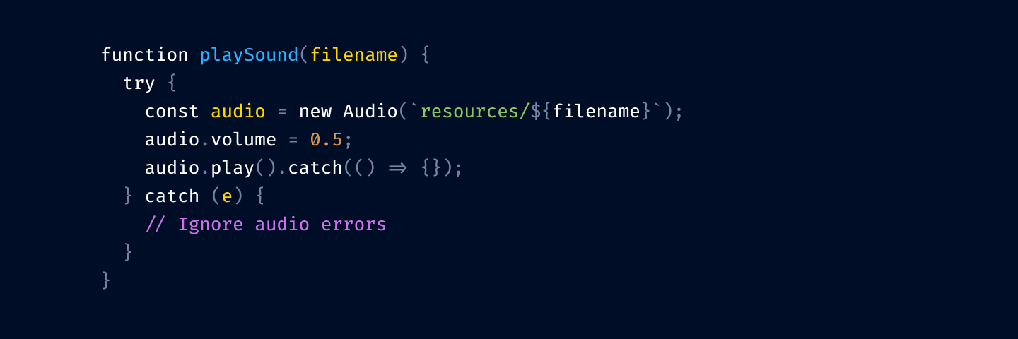
We don’t use red here because you usually need it for squiggly lines and errors.
This is still one color too many, so I unify numbers and strings to both use green:
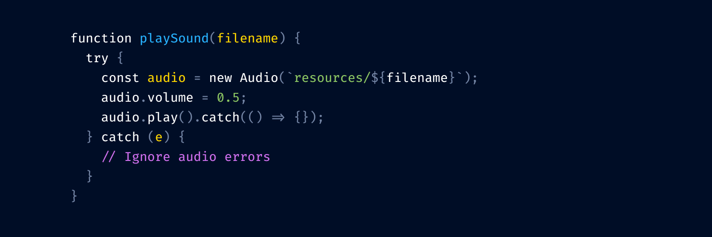
Finally, let’s rotate colors a bit. We want to respect nesting logic, so function declarations should be brighter (yellow) than variable declarations (blue).
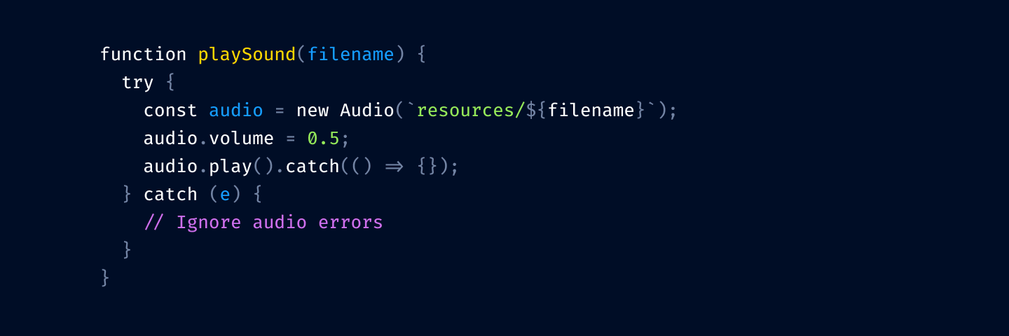
Compare with what we started:
In my opinion, we got a much more workable color theme: it’s easier on the eyes and helps you find stuff faster.
I’ve been applying these principles for about 8 years now.
I call this theme Alabaster and I’ve built it a couple of times for the editors I used:
It’s also been ported to many other editors and terminals; the most complete list is probably here. If your editor is not on the list, try searching for it by name—it might be built-in already! I always wondered where these color themes come from, and now I became an author of one (and I still don’t know).
Feel free to use Alabaster as is or build your own theme using the principles outlined in the article—either is fine by me.
As for the principles themselves, they worked out fantastically for me. I’ve never wanted to go back, and just one look at any “traditional” color theme gives me a scare now.
I suspect that the only reason we don’t see more restrained color themes is that people never really thought about it. Well, this is your wake-up call. I hope this will inspire people to use color more deliberately and to change the default way we build and use color themes.
⚡ Tell us your thoughts in comments!
#️⃣ #syntax #highlighting #wrong #tonsky.me
🕒 Posted on 1760558657
