💥 Discover this awesome post from Hacker News 📖
📂 Category:
💡 Main takeaway:
When DALL-E came out, it took me a couple of weeks to pick my jaw up
from the floor. I would go to sleep excited to wake up to a full quota, with a
backlog of prompts to try. It was magical, miraculous. Like discovering a new
universe. I compiled the best art in this post.
The other day a friend ran some of my old prompts through Nano Banana Pro
(NBP), and put the old models side by side with the new. It’s interesting how
after years of progress, the models are much better better at making images, but
infinitely worse at making art.
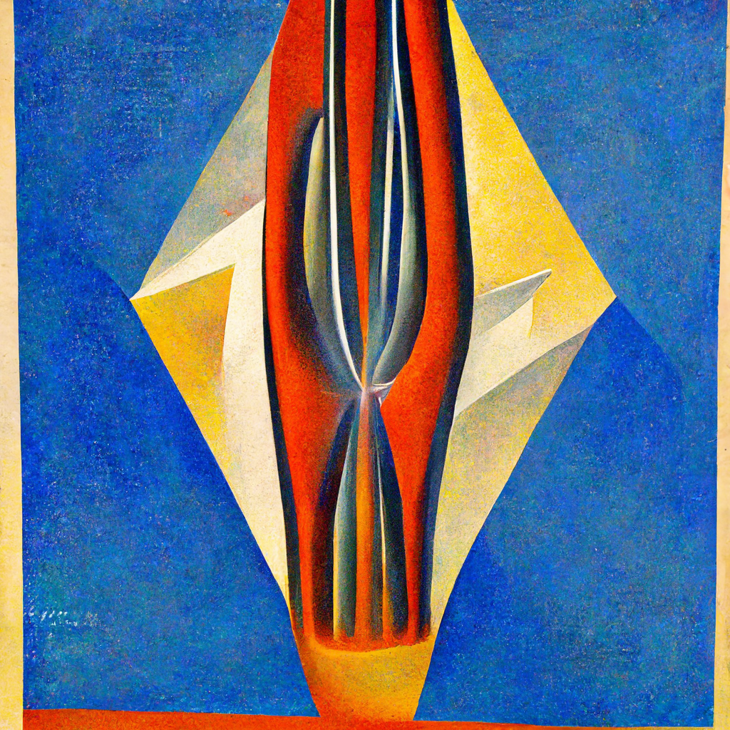
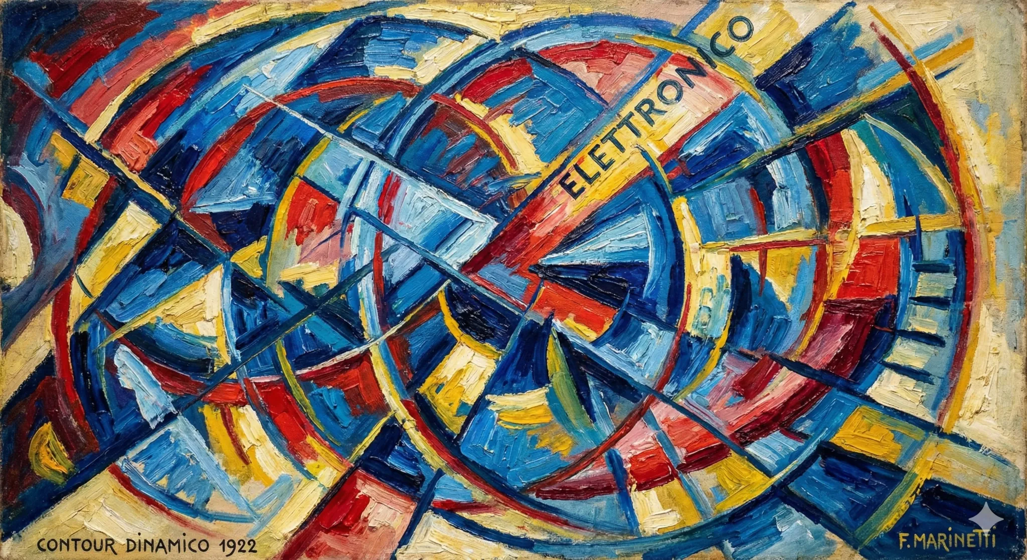
Electron contours in the style of Italian futurism, oil on canvas, 1922,
trending on ArtStation.
The old Midjourney v2 renders this:
NBP renders this:
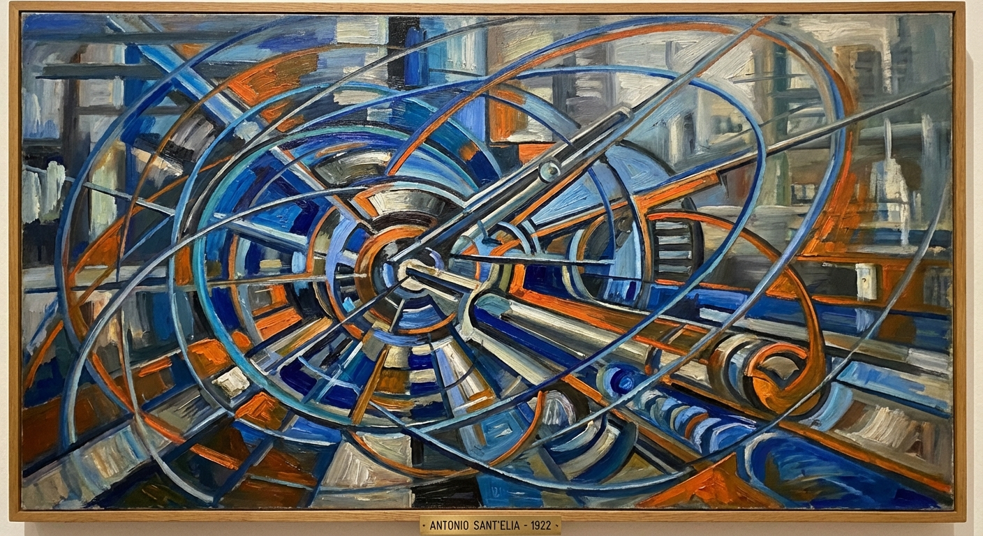
Admiteddly MJ’s output doesn’t look quite like futurism. But it looks like
something. It looks compelling. The colours are bright and vivid. NBP’s output
is studiously in the style of Italian futurism, but the colours are so muted and
dull.
Maybe the “trending on ArtStation” is a bit of an archaism and impairs
performance. Let’s try again without:
Meh.
Painting of an alley in the Kowloon Walled City, Eugène Boudin, 1895, trending
on ArtStation.
MJ gave me this:
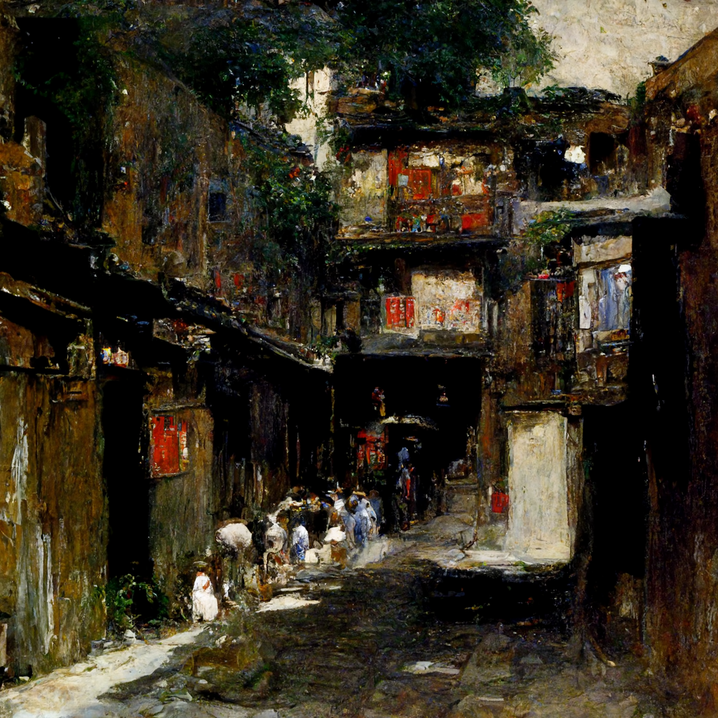
And it looks nothing like the Kowloon Walled City. But it’s
beautiful. It’s coarse, impressionistic, vague, evocative, contradictory. It’s
brimming with mystery. And it is, in fact, in the style of Eugène
Boudin. This, by contrast, is the NBP output:
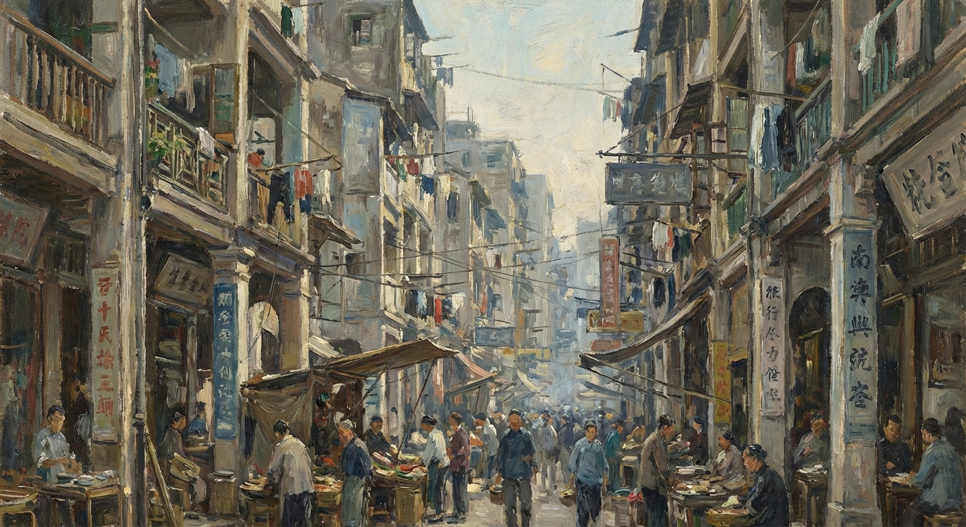
Sigh. It looks like every modern movie: so desaturated you feel you’re going
colourblind. Let’s try forcing it:
Painting of an alley in the Kowloon Walled City, Eugène Boudin, 1895. Make it
coarse, impressionistic, vague, evocative, contradictory, brimming with
mystery.
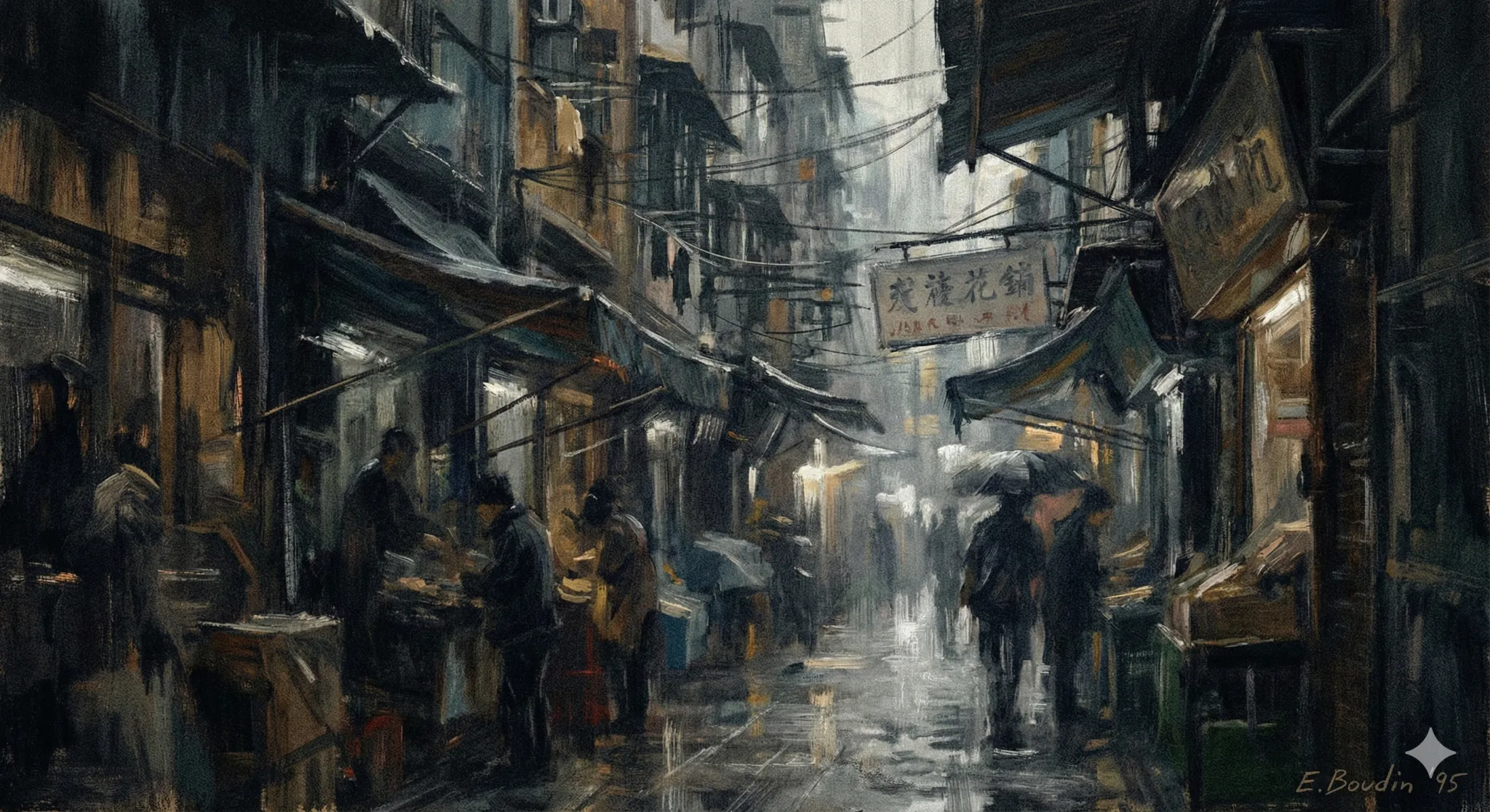
This is somewhat better, but why is it so drab and colourless? Is the machine
trying to make me depressed?
Attar and Ferdowsi in a dream garden, Persian miniature, circa 1300, from the
British Museum.
Midjourney v2:
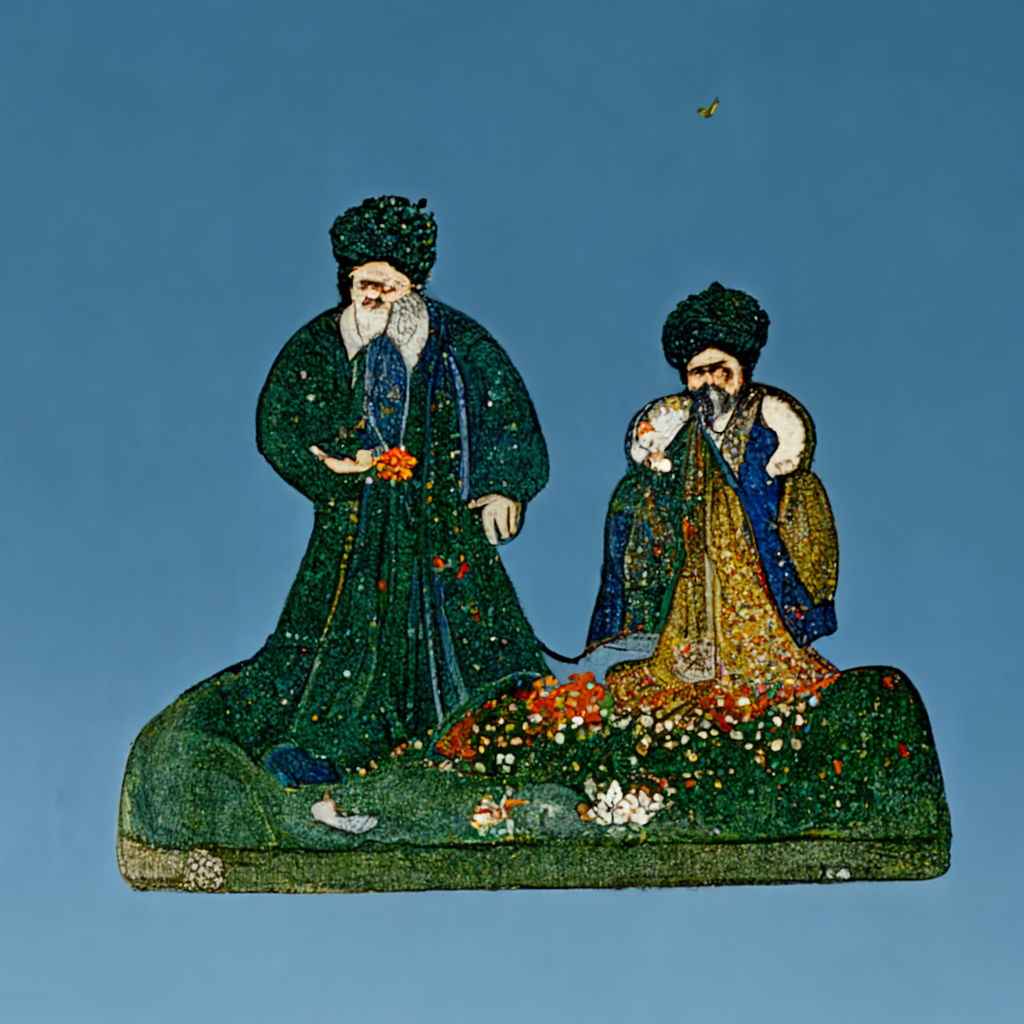
It doesn’t quite look like anything. But it is beautiful, and evocative. I like
to imagine that little splotch of paint on the upper right is hoopoe. The NBP output:
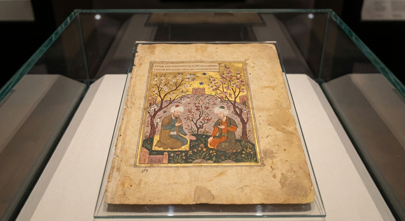
Well, it looks like a Persian miniature. The “from the British
Museum” bit, I meant that to be interpreted evocatively, rather than
literally. The prompt cites a fictional object, bringing it into the
existence. But NBP reads this as: no, this is a photograph of a Persian
miniature in the British Museum.
The Burning of Merv by John William Waterhouse, 1896, from the British Museum.
Midjourney v2:
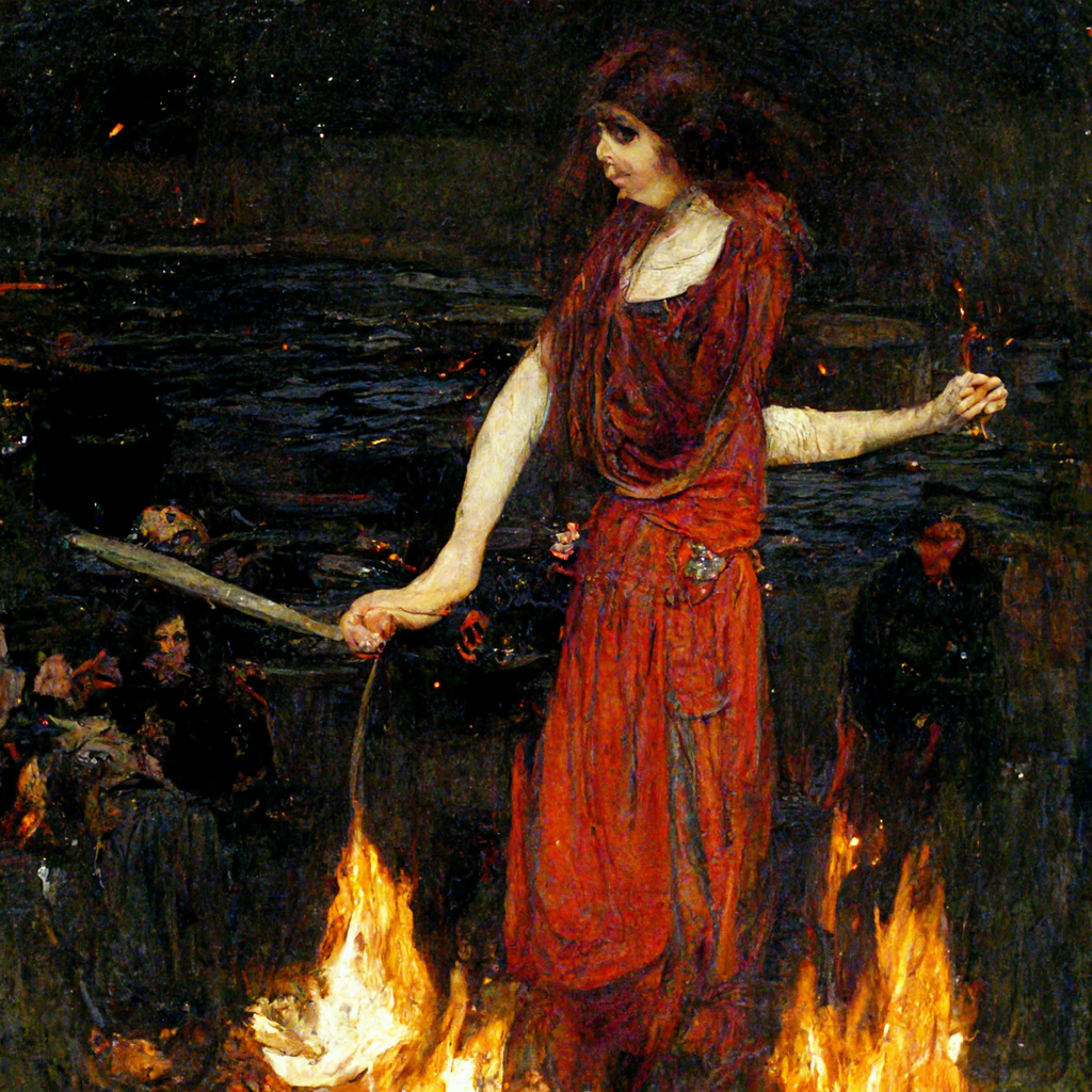
It does look like Waterhouse. Semantically there’s room to argue: it looks
like a woman being burnt at the stake, not the sack of a city. But
aesthetically: it’s gorgeous. The flames are gorgeous, the reds of the dress are
gorgeous. Look at the reeds in the background, and the black water, that looks
like tarnished silver or pewter. The faces of the crowd. Is that a minotaur on
the lower left, or a flower? What is she holding on her bent left arm? A
crucifix, a dagger? You could find entire universes in this image, in this
1024×1024 frame.
By contrast, this is the NBP output:
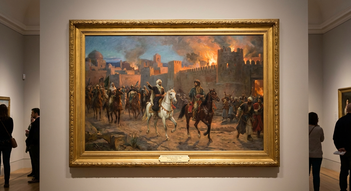
What can one say? It doesn’t look like Waterhouse. The horsemen wear Arab or
Central Asian dress, but Merv was sacked in the year 1221 by the Mongol
Empire. And, again, the “British Museum” line is taken literally rather
than evocatively.
Portrait of Ada Lovelace by Dante Gabriel Rossetti, 1859, auctioned by Christie’s.
Midjourney:
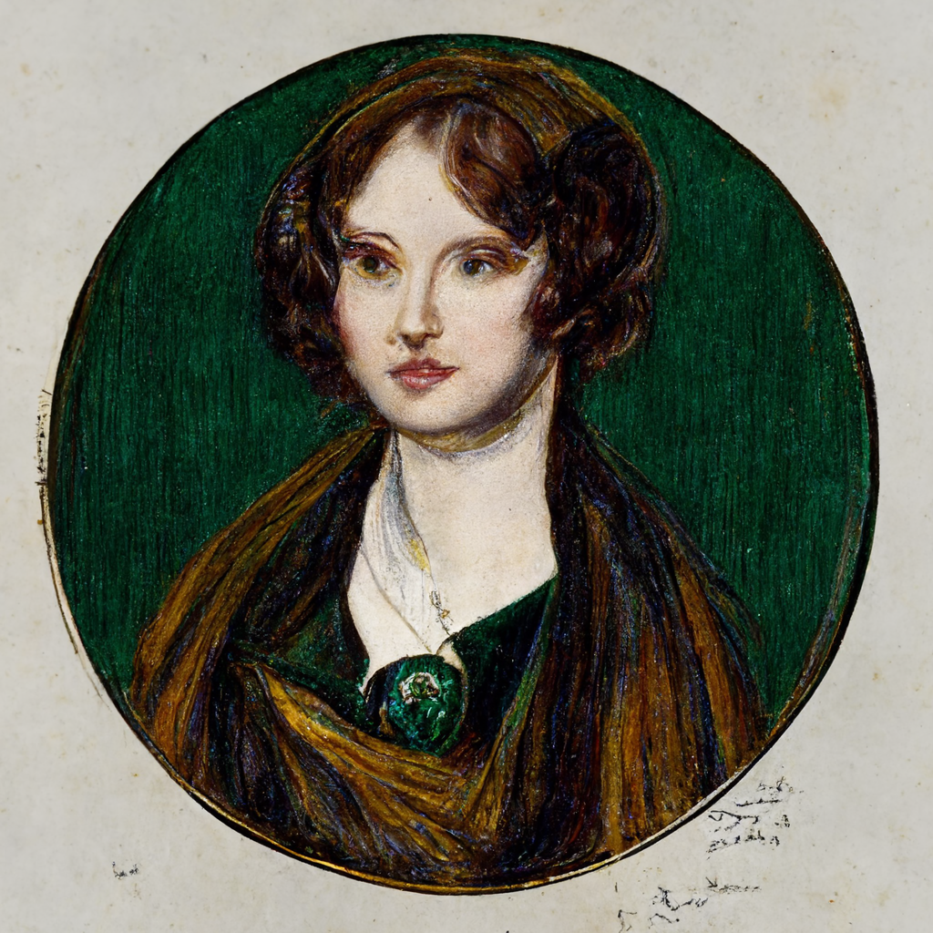
This is beautiful. It is beautiful because the coarse, impressionistic
brushstroke is more evocative than literal. And it actually looks like a woman
drawn by Rossetti. And look at the greens! Gorgeously green. The palette
is so narrow, and the painting is so beautiful.
The NBP output:
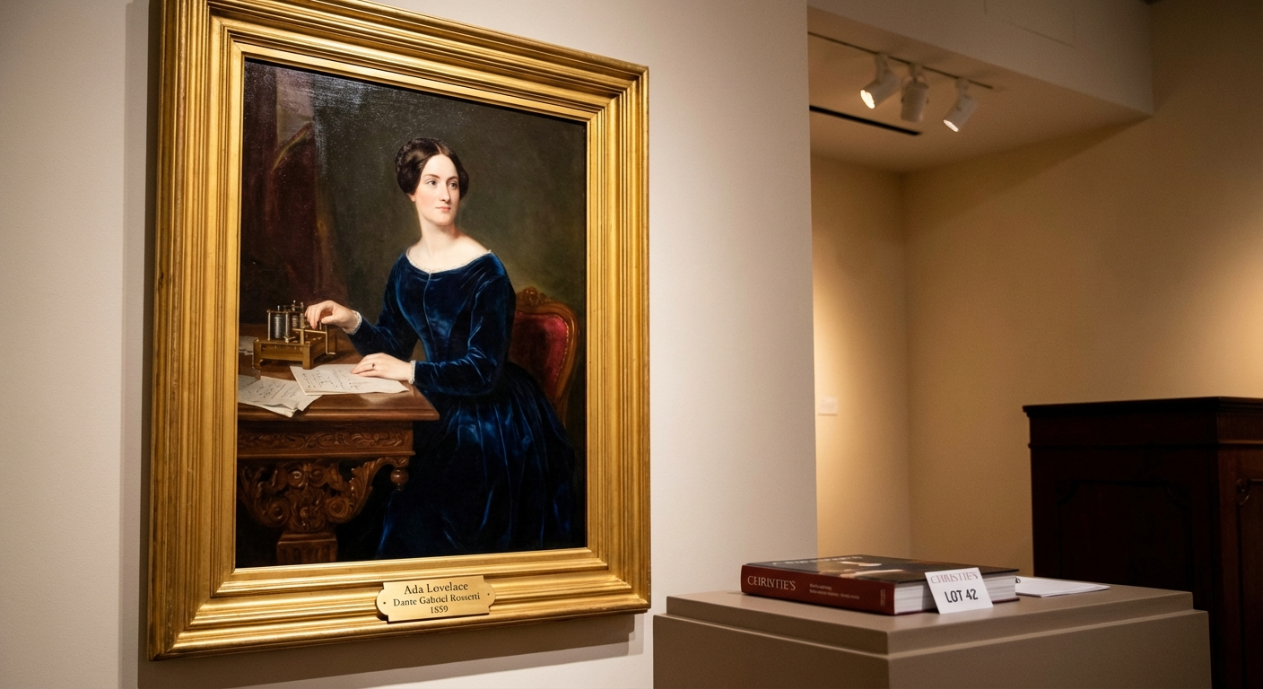
Pure philistinism. “Auctioned by Christie’s”, again, is meant to be evocative:
“this is the kind of painting that would be sold at auction”. But NBP makes it a
photograph of a painting at an auction house. Fine, I suppose I got what I asked
for.
But the woman doesn’t look like Rossetti! This is absurd. How can a model from
2022 get this right, and the SOTA image generation model gives us generic oil
painting slop?
A Persian miniature of the cosmic microwave background, from Herat circa 1600, trending on ArtStation
Midjourney v2:
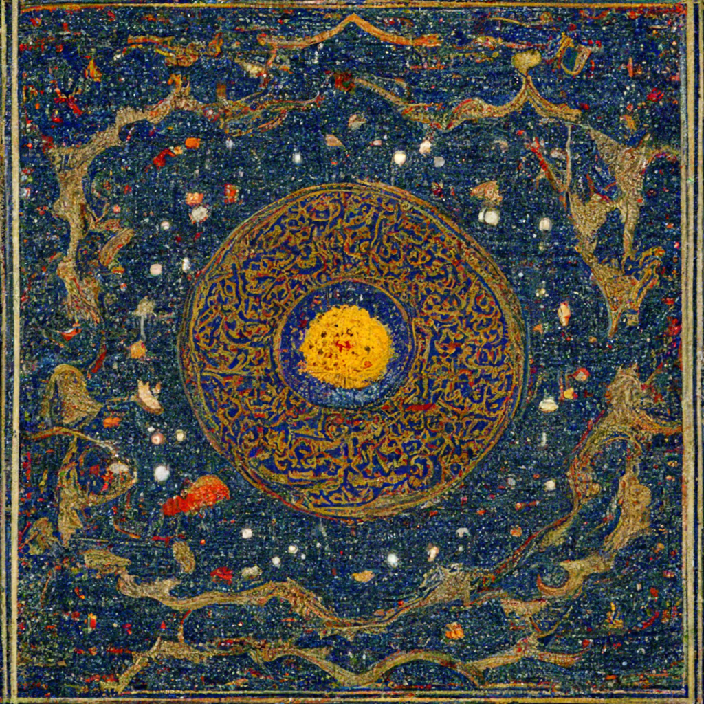
NBP:
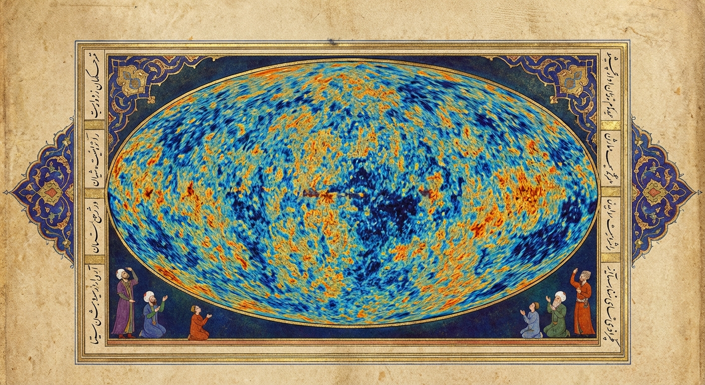
Again: what can one say?
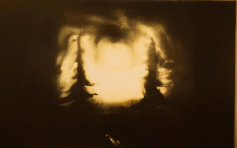
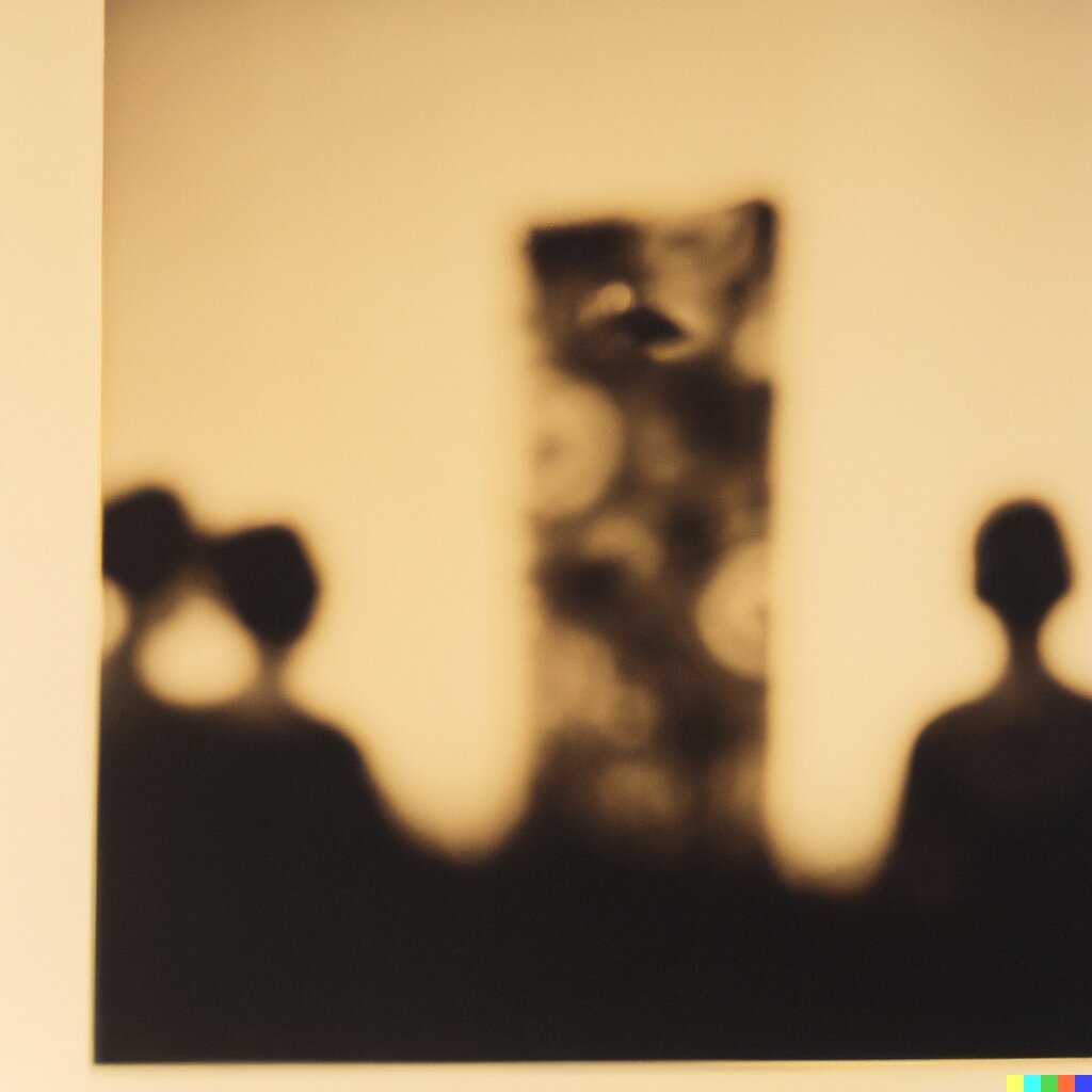
Dream Story, 1961, blurry black and white photograph, yellow tint, from the Metropolitan Museum of Art.
This is one of my favourite DALL-E 2 outputs:
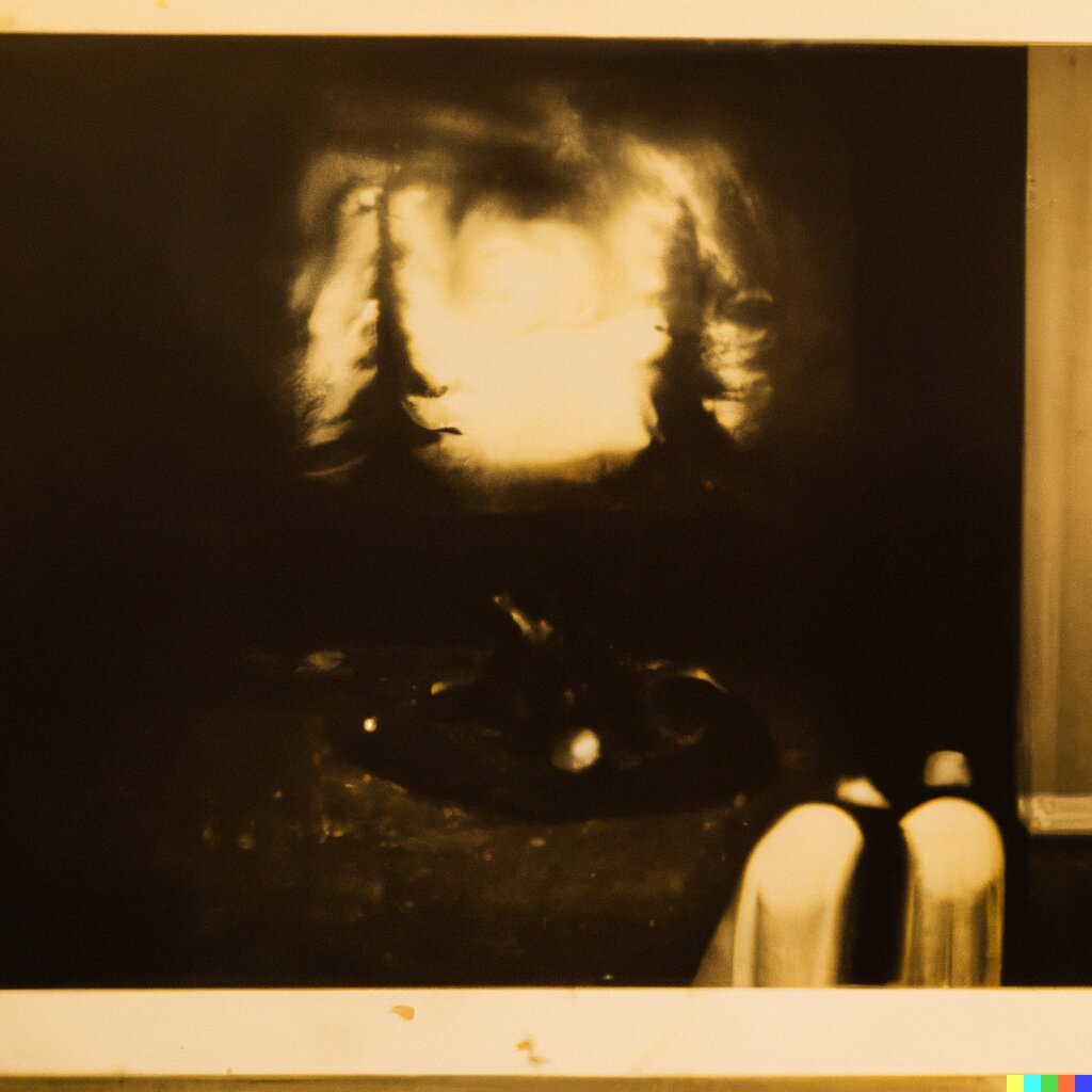
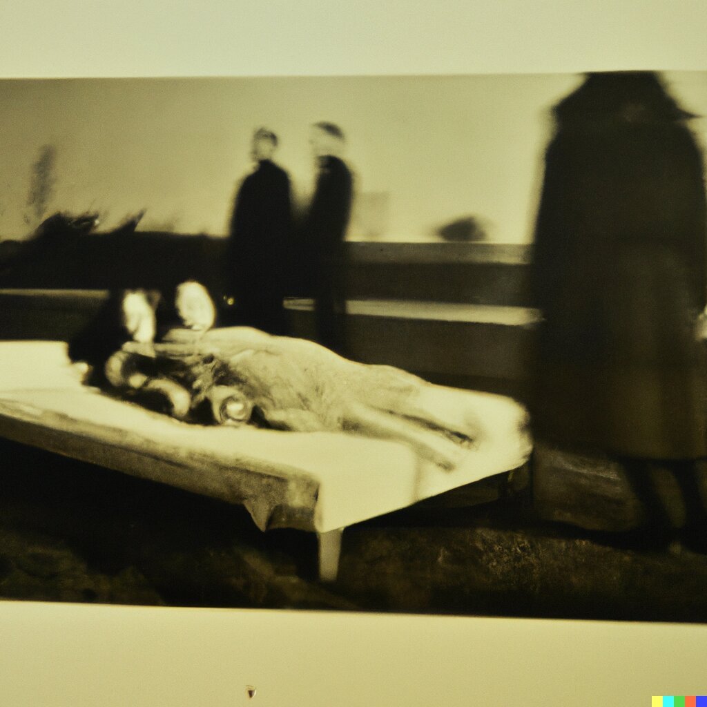
They remind me of The King in Yellow. I love these because of how
genuinely creepy and mysterious they are. You could pull a hundred horror
stories from these.
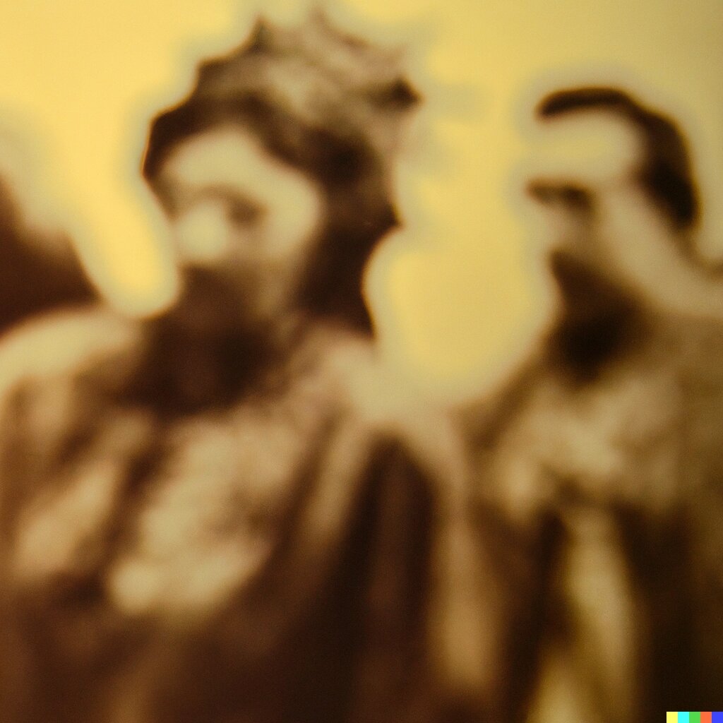
It is hard to believe how bad the NBP output is:
What are we doing here? The old models were beautiful and compelling because the
imperfections, vagueness, mistakes, and contradictions all create these little
gaps through which your imagination can breathe life into the art. The images
are not one fixed, static thing: they can be infinitely many things.
The new models—do I even need to finish this sentence? They’re too precise and
high-resolution, so they cannot make abstract, many-faced things, they can only
make specific, concrete things.
We need to make AI art weird again.
🔥 Tell us your thoughts in comments!
#️⃣ #Coarse
🕒 Posted on 1766326694