✨ Discover this awesome post from Hacker News 📖
📂 **Category**:
💡 **What You’ll Learn**:
If active distraction of readers of your own website was an
Olympic Sport, news publications would top the charts every
time.
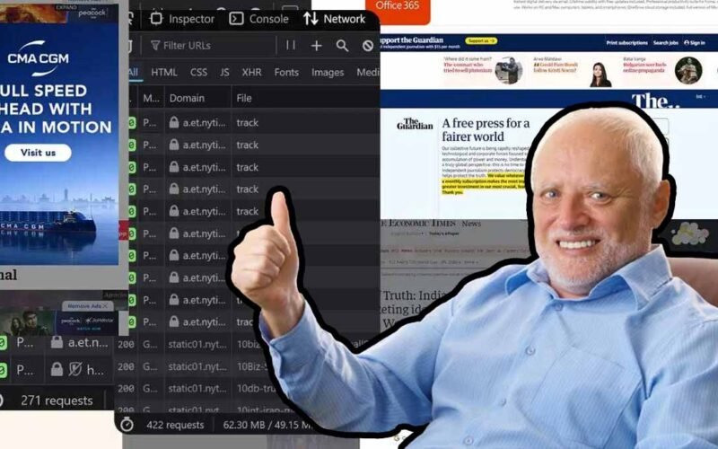
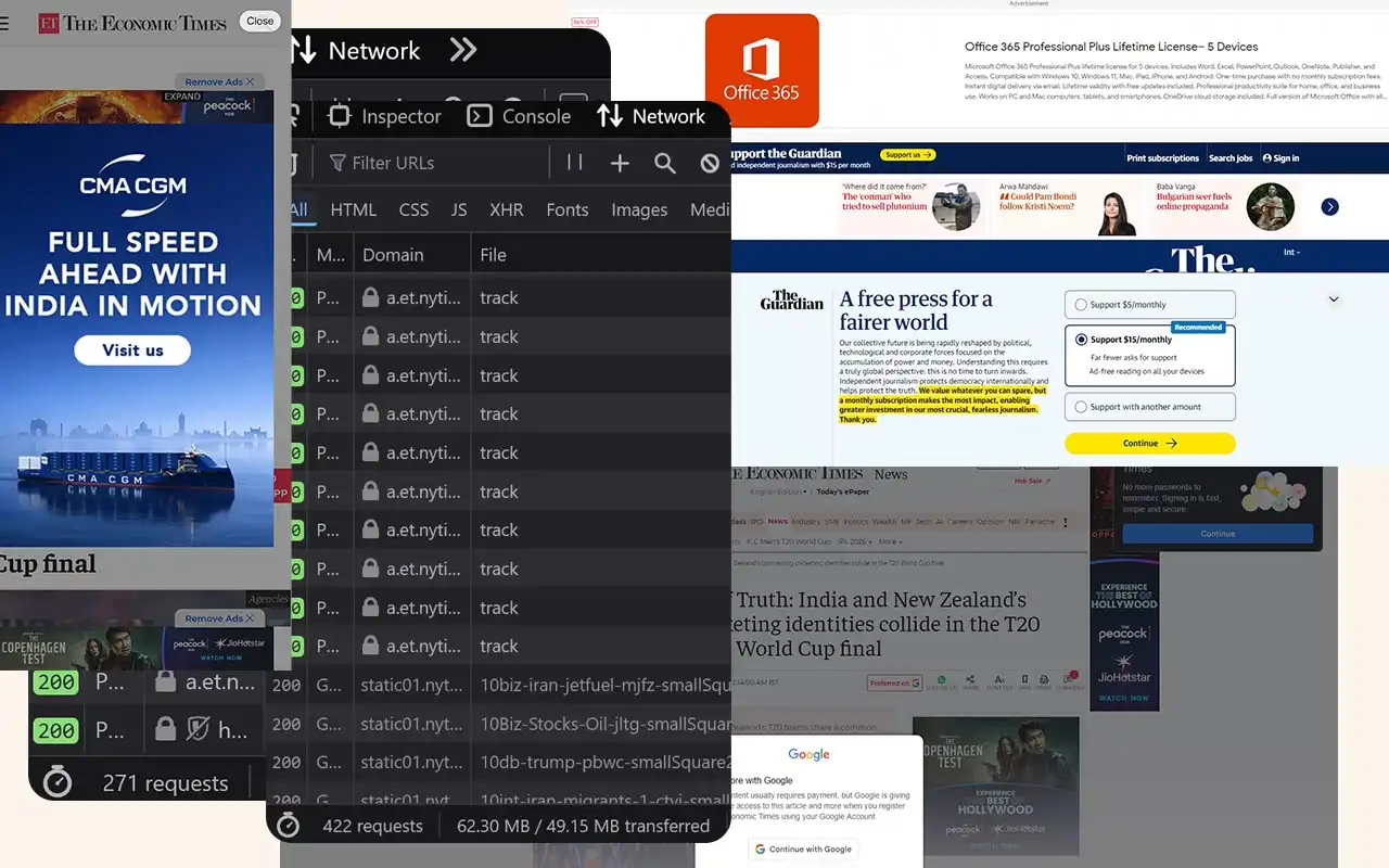
I went to the New York Times to glimpse at four headlines
and was greeted with 422 network requests and 49 megabytes
of data. It took two minutes before the page settled. And
then you wonder why every sane tech person has an adblocker
installed on systems of all their loved ones.
It is the same story across top publishers today.
To truly wrap your head around the phenomenon of a 49 MB web
page, let’s quickly travel back a few decades. With this page load,
you would be leaping ahead of the size of Windows 95 (28
floppy disks). The OS that ran the world fits perfectly
inside a single modern page load. In 2006, the iPod reigned
supreme and digital music was precious. A standard
high-quality MP3 song at 192 kbps bitrate took up around 4
to 5 MB. This singular page represents roughly 10 to 12
full-length songs. I essentially downloaded an entire
album’s worth of data just to read a few paragraphs of text.
According to the
International Telecommunication Union, the global average broadband internet speed back then was
about 1.5 Mbps. Your browser would continue loading this
monstrosity for several minutes, enough time for you to walk
away and make a cup of coffee.
If hardware has improved so much over the last 20 years, has
the modern framework/ad-tech stack completely negated
that progress with abstraction and poorly architected bloat?
CPU throttles, tracking and privacy nightmares
News websites really really like to track.
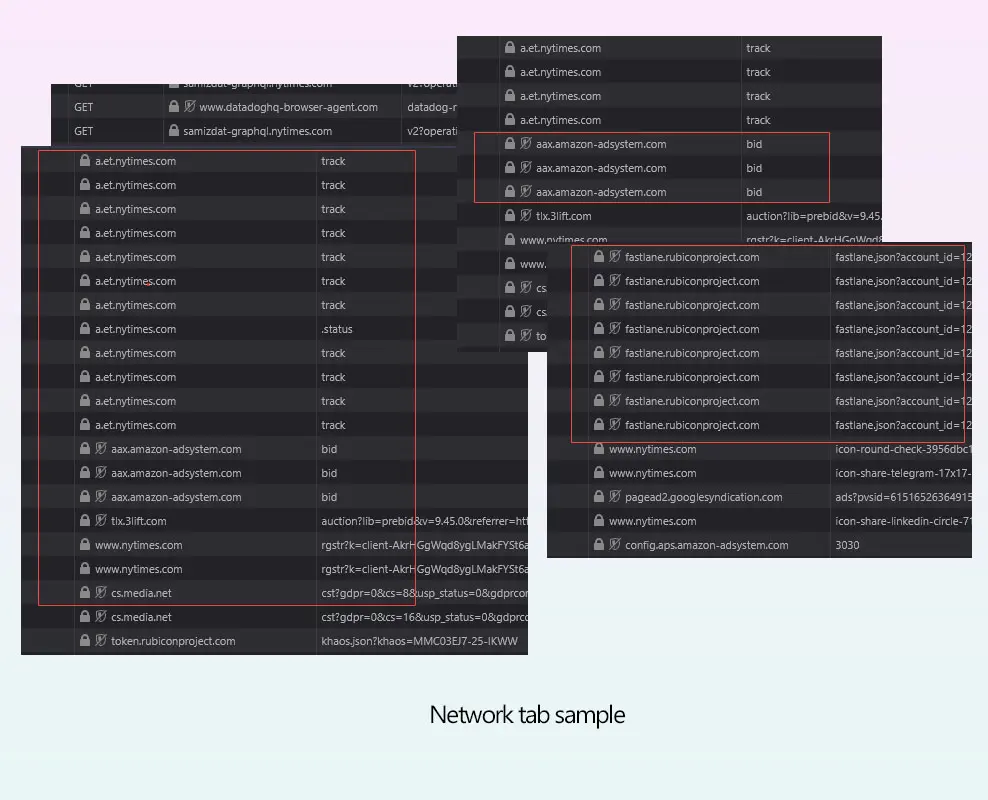
For the example above, taking a cursory look at the network waterfall for a single
article load reveals a sprawling, unregulated programmatic
ad auction happening entirely in the client’s browser.
Before the user finishes reading the headline, the browser
is forced to process dozens of concurrent bidding requests
to exchanges like Rubicon Project (fastlane.json) and Amazon
Ad Systems. While these requests are asynchronous over the
network, their payloads are incredibly hostile to the
browser’s main thread. To facilitate this, the browser must
download, parse and compile megabytes of JS. As a publisher,
you shouldn’t run compute cycles to calculate ad yields
before rendering the actual journalism.
- The user requests text.
- The browser downloads 5MB of tracking JS.
-
A silent auction happens in the background, taxing the
mobile CPU. -
The winning bidder injects a carefully selected
interstitial ad you didn’t ask for.
Common story across many offenders
A relentless heartbeat of surveillance.
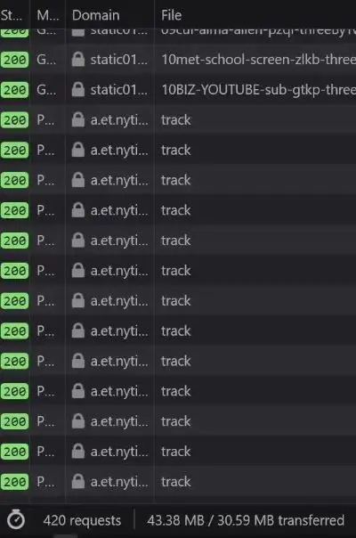
Beyond the sheer weight of the programmatic auction, the
frequency of behavioral surveillance was surprising. There is
user monitoring running in parallel with a relentless
barrage of POST beacons firing to first-party tracking
endpoints
(a.et.nytimes.com/track). The background invisible pixel drops and redirects to
doubleclick.net
and
casalemedia
help stitch the user’s cross-site identity together across
different ad networks.
When you open a website on your phone, it’s like
participating in a high-frequency financial trading market.
That heat you feel on the back of your phone? The sudden
whirring of fans on your laptop? Contributing to that plus
battery usage are a combination of these tiny scripts.
Ironically, this surveillance apparatus initializes
alongside requests fetching
purr.nytimes.com/tcf
which I can only assume is Europe’s IAB transparency and
consent framework. They named the consent framework endpoint
purr. A cat purring while it rifles through your pockets.
So therein lies the paradox of modern news UX. The mandatory
cookie banners you are forced to click are merely legal
shields deployed to protect the publisher while they happily
mine your data in the background. But that’s enough about NYT.
The Economics of Hostile Architecture
Publishers aren’t evil but they are desperate. Caught in
this programmatic ad-tech death spiral, they are trading
long-term reader retention for short-term CPM pennies. The
modern ad industry is slowly de-coupling the creator from
the advertiser. They weaponize the UI because they think
they have to.
Viewability and time-on-page are very important metrics
these days. Every hostile UX decision originates from this
single fact. The longer you’re trapped on the page, the
higher the CPM the publisher can charge. Your frustration is
the product. No wonder engineers and designers make every UX
decision that optimizes for that. And you, the reader, are
forced to interact, wait, click, scroll multiple times
because of this optimization. Not only is it a step in the
wrong direction, it is adversarial by design.
The reader is not respected enough by the software. The
publisher is held hostage by incentives from an auction
system that not only encourages but also rewards dark
patterns.
And almost all modern news websites are guilty of some
variation of anti-user patterns. As a reminder, the NNgroup
defines interaction cost as the sum of mental and physical
efforts a user must exert to reach their goal. In the
physical world, hostile architecture refers to a park bench
with spikes that prevent people from sleeping. In the
digital world, we can call it a system carefully engineered
to extract metrics at the expense of human cognitive load.
Let’s also cover some popular user-hostile design choices
that have gone mainstream.
The Pre-Read Ambush
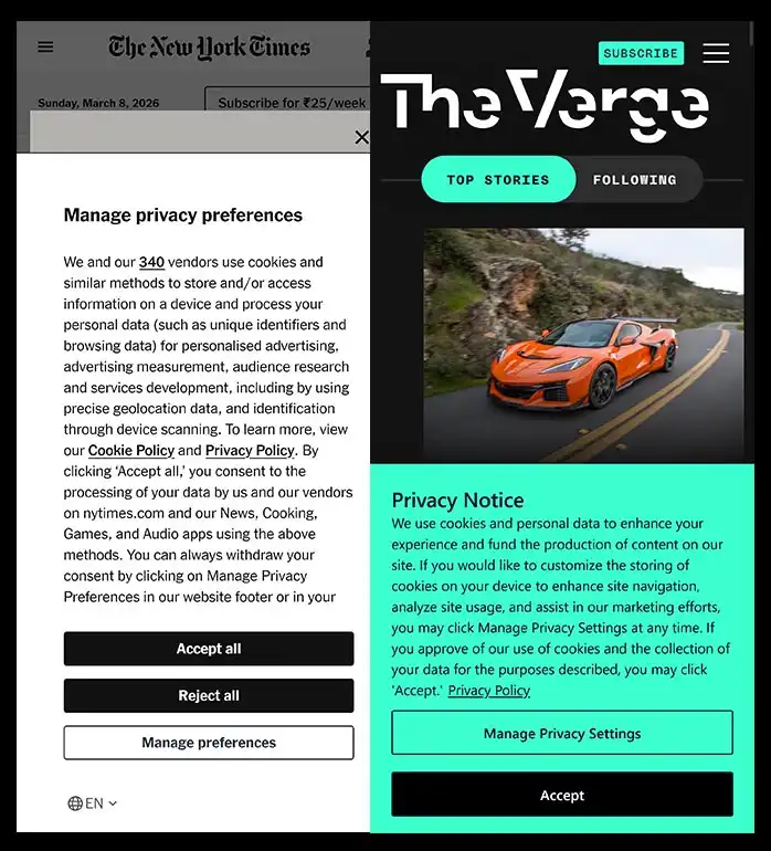
Selected GDPR examples
The advantage and disadvantages of these have been
discussed in tech circles ever since they launched.
When a user clicks a news link, they have a singular purpose
of reading the headline and going through the text. The
problem is that upon page load, users are greeted by what I
call
Z-Index Warfare.
The GDPR/Cookie banners occupy the bottom 30%. The user
scrolls once and witnesses a “Subscribe to our Newsletter”
modal. Meanwhile the browser has started hammering them with
allow notification prompts.
The user must perform visual triage, identify the close
icons (which are deliberately given low contrast) and
execute side quests just to access the 5KB of text they came
for. Let’s look at how all these anti-patterns combine into
a single, user-hostile experience. Here is a teardown of a
standard page load of Economic Times.
UX Teardown
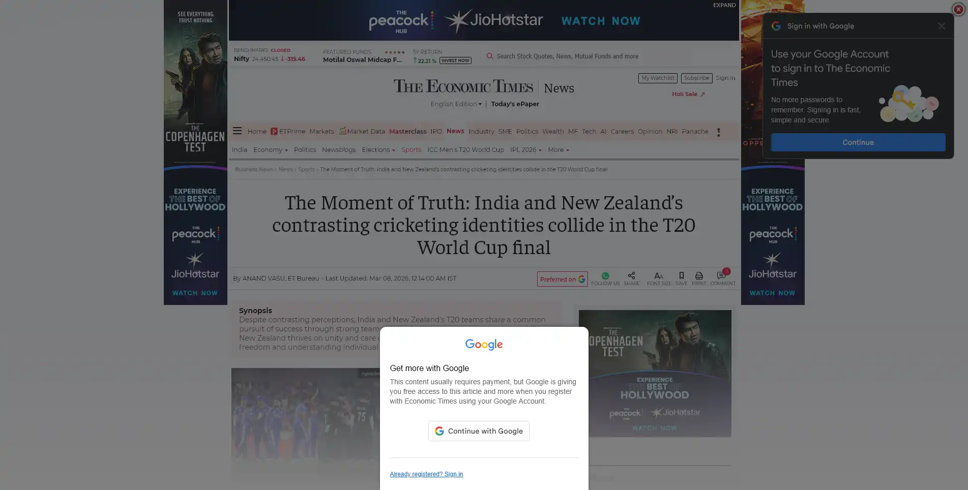
Economic Times:
Imagine deploying this to production. Does anyone even
care about how their end-product appears to a user
anymore?
Critical Error
1
The Double Modal Ambush
The user is hit with not one, but two simultaneous
Google sign-in prompts. One is a centered custom
modal completely obscuring the text, while the
standard Google tap modal slides in from the top
right. This is a severe violation of serialized
onboarding, causing confusion to a first-time user.
Severe Issue
2
Viewport suffocation
Examine the screen real estate. We have a top banner
ad, a left skyscraper, a right skyscraper and an
inline ad block. The actual article content occupies
roughly 15% of the screen real-estate. The publisher
has inverted the content-to-chrome ratio.
Laborious non-work
3
Unacceptable Interaction Cost
Before reading a single sentence, the user must
locate and click the “X” on the center modal, do the
same for the top right modal, and scroll past the
massive top banner. By forcing them to perform
digital housekeeping just to access the content, the
publisher creates unnecessary hurdles for the
reader.
Sources & UX Heuristics Violated
-
Aesthetic and Minimalist Design
– Interfaces should not contain information that
is irrelevant or rarely needed
[NN/g Usability Heuristic #8] -
Interaction Cost– The double-modal forces high physical
interaction cost before value is delivered
[NN/g Interaction Cost] -
Core Web Vitals (Intrusive
Interstitials)
– Google’s own search guidelines penalize pages
where content is not easily accessible due to
intrusive pop-ups covering the main content
immediately after navigation
[Google Search Central]
The CLS Disaster
A user is on paragraph #2. Suddenly, the text jumps down 250
pixels and they lose their place. Why? An ad network finally
resolved its bidding process and injected an iframe above
the viewport. In Google’s Core Web Vitals, this is measured
as Cumulative Layout Shift. High CLS correlates often
directly with high abandonment rates.
Take into context that the CLS disasters, the intrusive
modals or even the render-blocking scripts all supposedly
lower your page’s scores. And Google officially penalizes
all of these for SEO, well in theory. What’s strange is that
Google’s own ad products are what’s helping enable this too.
Domain authority and media-house reputation ensure these
sites keep appearing at the top of your results. Google’s
search arm penalizes the crime while Google’s ads arm sells
the weapon.
The Sticky Video Player
Publishers love embedding auto-playing videos these days,
which isn’t really popular. You’ll find mulitple forum,
Reddit, HN, or Twitter threads about it.
To make it somehow worse…when you scroll down, you think
it would leave you as it leaves the viewport. No. It
detaches, shrinks and pins itself to the bottom right of
your screen and continues playing. It keeps the distraction going and
as if teasing you, features a microscopic ‘X’ button with a
tiny hit area (violating Fitts’s Law).
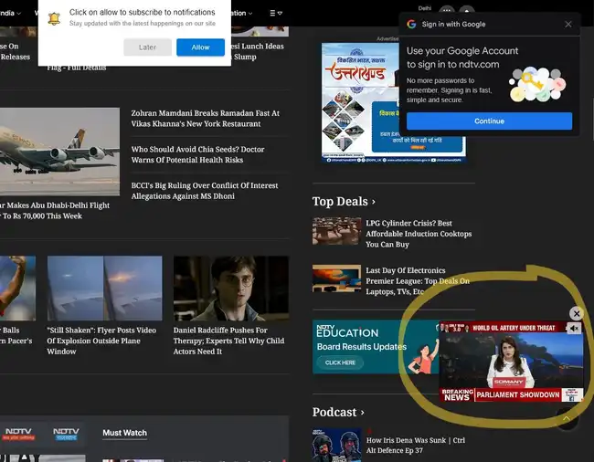
NDTV’s homepage
Autoplaying videos are commonplace these days.
You can bet the people measuring metrics boast about video
pre-roll ads having the highest CPMs or whatever.
Innovative Hindrances
On mobile, vertical space is your most precious commodity.
The average mobile viewport is about 800px high. And many
news sites utilize a sticky header (with the logo and
hamburger menu) that consumes 80-100px. Add a sticky share
bar along with the mobile browser’s own URL bar and
navigation buttons and you have reduced space for content
even further.
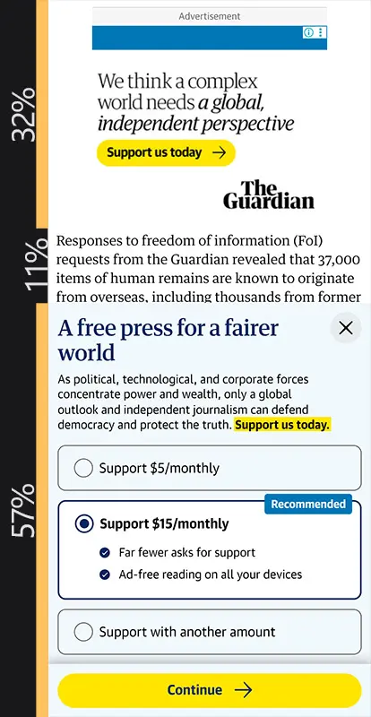
[Ads and Modals: 89%] vs [Content: 11%]
The actual content on this Guardian webpage is limited
to 11% of the viewport. And this does not account for
the browser navigation bar on an actual phone.
Expert Comment
“When designers are encouraged to optimize for
newsletter signups, text signups, or registrations at
all costs, they sometimes make decisions that prioritize
those metrics over all else. However, in the long run,
these tactics erode users’ trust and their relationship
to the brand.” – NNgroup
[Source]
User’s actual reading window is now a claustrophobic slit in
the center of their phone. It creates a feeling of visual
suffocation. They are forced to scroll 3x more often thereby
increasing the interaction cost.
Then there is the
fat-finger
tax. ‘X’ buttons immediately adjacent to ad hit-boxes is a
calculated mathematical risk by ad-ops teams to generate
accidental clicks. These close buttons can easily be bigger,
especially on mobile screens but they’re not. Feature, not
bug terrority.
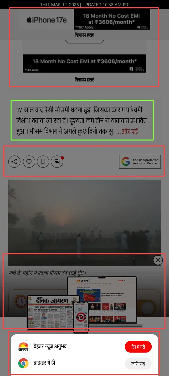
Hall of fame: Jagran
Highlighted in red boxes – Open in App obstruction,
Modal to subscribe, advert and share section.
Highlighted in green box – Actual content
I grew up reading Dainik Jagran, it used to be one of India’s
most popular Hindi daily in print. And this is their website
today. The tiny sliver of content is masked behind not one
but two z-index warfare modules. A lot of websites actively
interfere the reader from accessing them by pestering them
with their “apps” these days.
I don’t know where this fascination with getting everyone
to download your app comes from.
Another recent peculiarity of the modern news websites is
the truncation of articles halfway through with a “Read
More” or “Continue Reading” button. A click event tells the
publisher which articles are driving engagement and gives
them an opportunity to load more adverts further down the
page.
Better is possible
As a publisher, you can’t force a user through 3-4
dismissive actions before content is properly visible and
expect the experience to be appreciated. Doing so is
equivalent to burning your user’s cognitive budget before
value is delivered. The business excuse of, “We need
compliance and lead generation” doesn’t end up benefiting
the user. If they haven’t read a single word of your
journalism, why would they subscribe to you?
Fix it by giving zero pop-ups before 60 seconds of dwell
time or 50% scroll depth. Instead of allowing independent
third-party scripts to inject uncoordinated overlays,
engineers must enforce a serialized onboarding queue one
overlay at a time, triggered by behavior and not by page
load. Create non-obtrusive accessible modals. If you have
to, combine the cookie consent and the newsletter ask into a
single, non-blocking bottom section. If a user dismisses it,
save the state to localStorage and never show it on the same
session.
Or better yet, inject the newsletter signup as a styled,
non-intrusive div between paragraphs 4 and 5. If the user
has scrolled that far, they are engaged. Not only does the
user’s interaction cost drop, the conversion rates might
actually increase because the intent aligns with the action.
Coming back to CLS, when we read, our brains map the spatial
location of the text. When a layout shifts unexpectedly, it
destroys the user’s spatial memory. The cognitive load
required to
re-find your place breaks the
state of flow.
As a publisher, you must reserve space for asynchronous
content. Wrap ad-slots and images in a container with a
defined aspect-ratio or fixed min-height. If the slot is
designated for a 300×250 medium rectangle, the container can
be hardcoded to:
min-height: 250px; background: var(–skeleton-loader);
or something. When the ad loads, the DOM doesn’t move. If
the ad fails to fill, collapse the container using something
like
ResizeObserver if
it is outside the current viewport. But avoid pushing text
down after the user has begun reading.
Sanity still exists
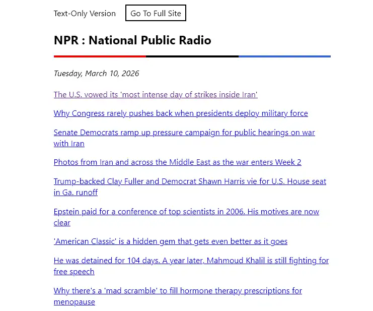
text.npr.org
A lightweight text-only version of NPR with no bloat,
tracking and modals.
Simplified versions like
text.npr.org,
lite.cnn.com
and
www.cbc.ca/lite
still exist out there. And RSS feeds do too. A vibrant
community of feed readers serve millions of people daily.
Subscribe to your choice of news publisher without the
overbearing modal attack or persistent tracking.
Existence of these proves that an audience longs for the
kind of no-frills content-heavy websites that are often
romanticized these days. In an era where so much is
happening around your country and the world, and internet
being so invasive in our lives, we ought to have better
outlets with both business and user needs meeting at a
middle ground.
At the end of the day
Good UX is highly desired and once you get it right, it
feels almost natural, intuitive. The current state of news
UI assumes that the reader is an adversary to be trapped and
monetized. Choosing between a profitable publication and a
fast, accessible user experience is not an either-or
decision. I guarantee you the engineers at these
publications hate this as much as we do, but they are
trapped by business models that prioritize short-term CPMs
over long-term readership. We just need to stop letting
third-party marketing scripts dictate the website’s
architecture.
No individual engineer at the Times decided to make reading
miserable. This architecture emerged from a thousand small
incentive decisions, each locally rational yet collectively
catastrophic.
They built a system that treats your attention as an
extractable resource. The most radical thing you can do is
refuse to be extracted. Close the tab. Use RSS. Let the
bounce rate speak for itself. These are vanity metrics until
enough people stop vanishing into them and then suddenly
they become a crisis.
About the Author I’m
Shubham, a full-stack product engineer passionate about
fixing hostile UI, building privacy-first tools (like my
YouTube extension with 51k+ DAU), and making the web usable
again. I am currently looking for my next role. If your team
needs an engineer who cares as much about the Network Tab as
they do about User Empathy,
let’s talk.
⚡ **What’s your take?**
Share your thoughts in the comments below!
#️⃣ **#49MB #Web #Page #thatshubham**
🕒 **Posted on**: 1773606469
🌟 **Want more?** Click here for more info! 🌟